Want your gift registry pages to match your brand? You can set the fonts, colors, and button styles for the public registry landing page without touching any code. This reference covers every option on the Appearance settings for SaveTo Wishlist Registry.
To open these settings, go to SaveTo Wishlist → Settings, open the Gift Registry tab, then select Appearance. The Gift Registry tab only appears when SaveTo Wishlist Registry is active alongside SaveTo Wishlist Lite, so if you can’t find it, check that both plugins are active.
Typography
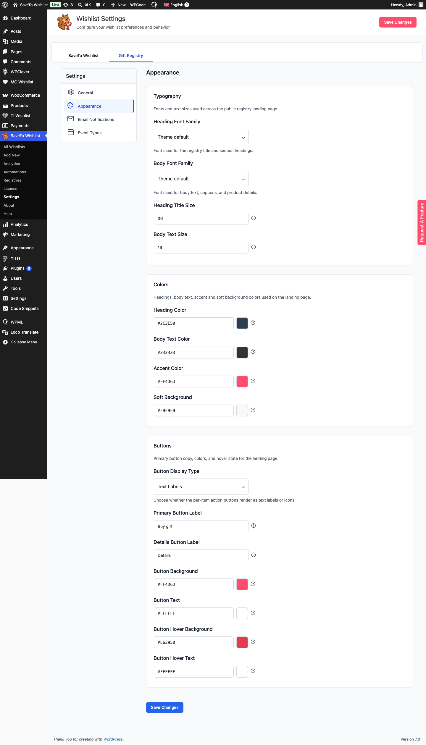
Control the fonts and text sizes used across the registry landing page. Leaving a font on Theme default leaves the font unset so the registry inherits your theme’s font. Pick a named option such as System UI (sans-serif), Helvetica / Arial, or Georgia (serif) to force a specific stack instead.
| Setting | Description | Default |
|---|---|---|
| Heading Font Family | Font used for the registry title and section headings. | Theme default |
| Body Font Family | Font used for body text, captions, and product details. | Theme default |
| Heading Title Size | Pixel size of the registry title. Range 20–72. | 36 |
| Body Text Size | Pixel size of body text. Range 12–22. | 16 |
Colors
| Setting | Description | Default |
|---|---|---|
| Heading Color | Color for the registry title, section headings, and item titles. | #2C3E50 |
| Body Text Color | Color for body copy. | #333333 |
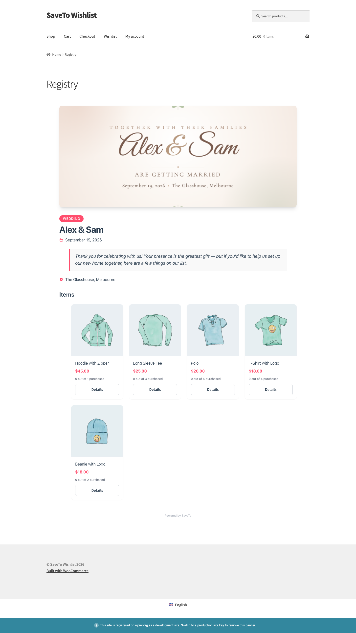
| Accent Color | Used for the event-type badge, price, icons, link hover, and the blockquote accent. | #FF4D6D |
| Soft Background | Background tint for the message blockquote and empty-state card. | #F9F9F9 |
Buttons
Style the buttons shoppers use to act on a gift. Each gift card shows a Details button that opens a product quick view, and the primary button (default label Buy gift) appears inside that quick view. The button color settings style that quick-view button only. If you set Button Display Type to Icons, the Primary Button Label and Details Button Label fields are hidden, since no text is shown.
| Setting | Description | Default |
|---|---|---|
| Button Display Type | Whether the per-item buttons show as text labels, icons, or icons with labels. | Text Labels |
| Primary Button Label | Label for the primary button in the product quick view that opens when a shopper clicks Details. | Buy gift |
| Details Button Label | Label for the secondary button that opens the product quick view. | Details |
| Button Background | Fill color of the primary action buttons. | #FF4D6D |
| Button Text | Text color on the primary action buttons. | #FFFFFF |
| Button Hover Background | Fill color when a primary button is hovered or focused. | #E63950 |
| Button Hover Text | Text color when a primary button is hovered or focused. | #FFFFFF |
Saving your changes
Click Save Changes to apply your settings. Refresh a registry page to see the new look.
Frequently asked questions
Do these settings change my whole store?
No. They only affect the public registry landing pages, not your wider theme or other WooCommerce pages.
Why don’t my changes show up?
Make sure you clicked Save Changes, then refresh the registry page. If you use a caching plugin, clear its cache so the updated styles load.
Can I use my own fonts?
You can pick from the built-in font choices. Theme default leaves the font unset so the registry inherits your theme’s font. Pick a named option to force a specific built-in font stack instead.
Need help?
If you have a question or run into any issues, we’re here to help.
- Premium users: submit a support ticket
- Free users: post in the WordPress.org support forum