

 Reviewed by
 The highest-impact wishlist change in most stores isn’t a setting guides talk about. It’s moving the Save to Wishlist button out of a quiet corner. Put it on the shop grid instead, where shoppers are already scanning.
Most stores install a wishlist plugin, check it works on one product page, then never look again. Saves trickle in, so the owner decides customers don’t use wishlists. The real problem is that most customers never saw the button.
To optimize your WooCommerce wishlist, the work isn’t in the plugin’s feature list. It sits in three places. Where the button lives, whether it looks clickable, and what happens right after someone taps it. This guide covers all three on the free WooCommerce wishlist plugin, then shows how to tell whether it worked.
I’d fix placement before anything else. It’s the change with the most room in it.
Jump to:
- Why Most WooCommerce Wishlists Get Almost No Use
- Where The Wishlist Button Should Actually Go
- Getting The Button Right On Mobile
- Making The Wishlist Button Look Clickable
- When The Wishlist Button Does Not Show Up
- Fixing The Wishlist Page Itself
- Getting More Saves From Guest Shoppers
- Measuring Whether Your Wishlist Optimization Worked
- Frequently Asked Questions: Optimize WooCommerce Wishlists
- Start Optimizing Your WooCommerce Wishlist Today
Why Most WooCommerce Wishlists Get Almost No Use
Wishlists underperform because shoppers never see the button, not because shoppers don’t want to save things. Saving is the lowest-friction action in your store, and low-friction actions still have to be visible to happen.
The demand is measurable. Across 50 studies, Baymard puts the average documented cart abandonment rate at 70.22%. The same list found 42% of US shoppers abandoned a cart because they were “just browsing / not ready to buy.” Those shoppers aren’t lost, they’re undecided, and a wishlist is built to hold exactly that.
Three patterns cause the drought:
- The button only lives on product pages. Shoppers who scan a category grid and never click through never get the option to save.
- The button looks like body text. If it doesn’t read as a control, it won’t be treated as one.
- The save is silent or slow. A shopper unsure the click registered will click again, or give up.
None of those are plugin limits. They’re defaults nobody revisited, which is why the work to optimize WooCommerce wishlists starts with visibility rather than features. Fixing them feeds straight into browse abandonment recovery later.
Where The Wishlist Button Should Actually Go

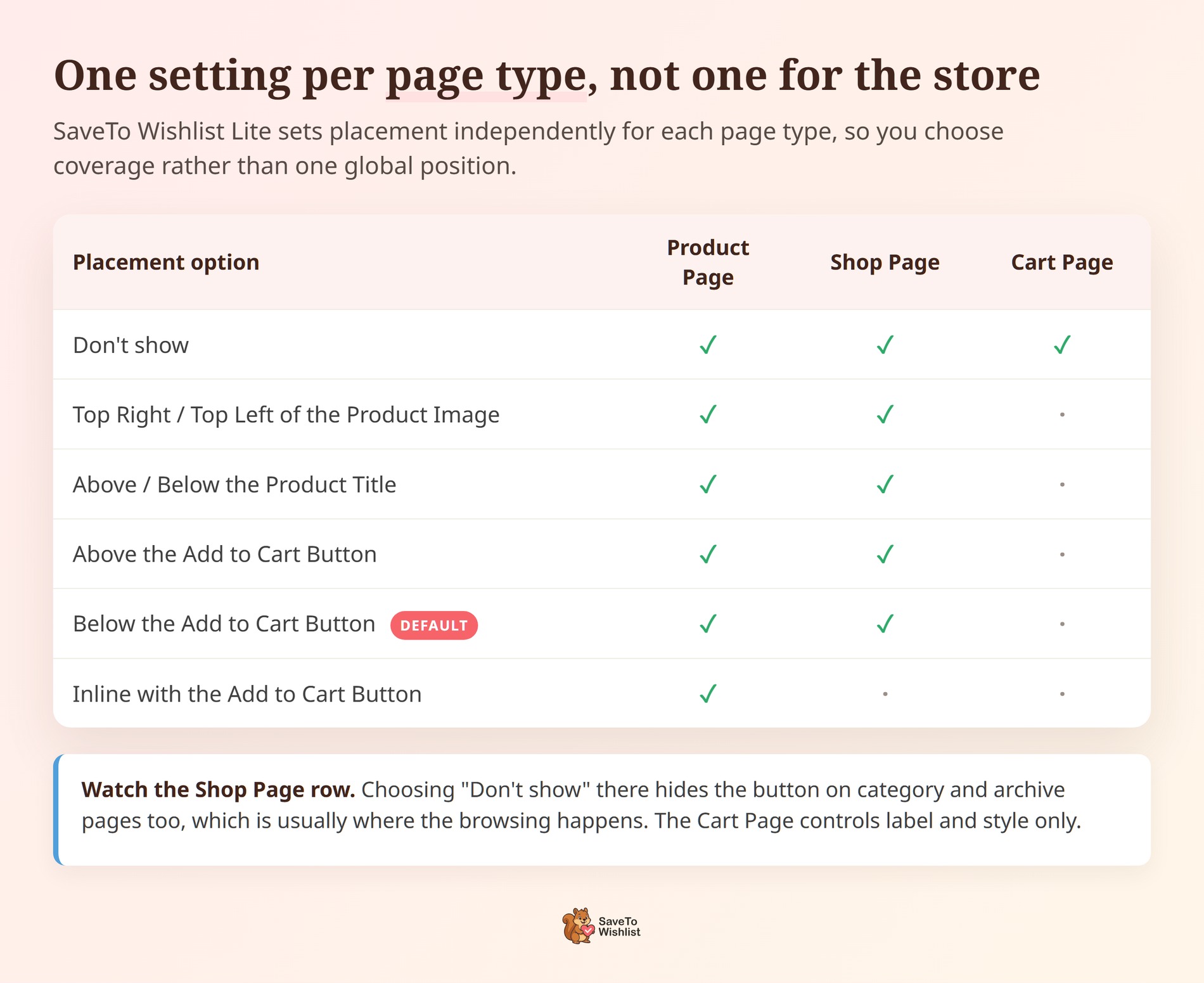
If you only make one change to optimize WooCommerce wishlists, make it this one. Put the button wherever a shopper first feels interest, which is usually the shop grid rather than the product page. SaveTo Wishlist Lite sets placement independently for your Product Page, Shop Page and Cart Page. Each one also carries a “Don’t show” option. So you’re choosing coverage, not one global position.
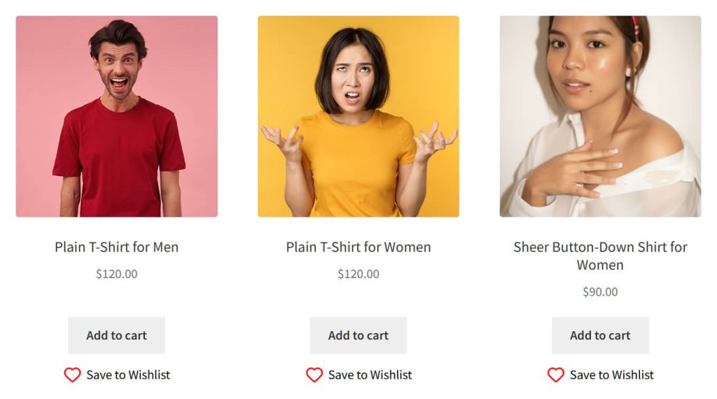
We checked this on staging running SaveTo Wishlist Lite. The button renders across the whole shop product loop, not only on product pages. Twelve separate Save to Wishlist buttons appeared on one /shop/ page, one per tile. That’s twelve chances to capture intent before the shopper commits.
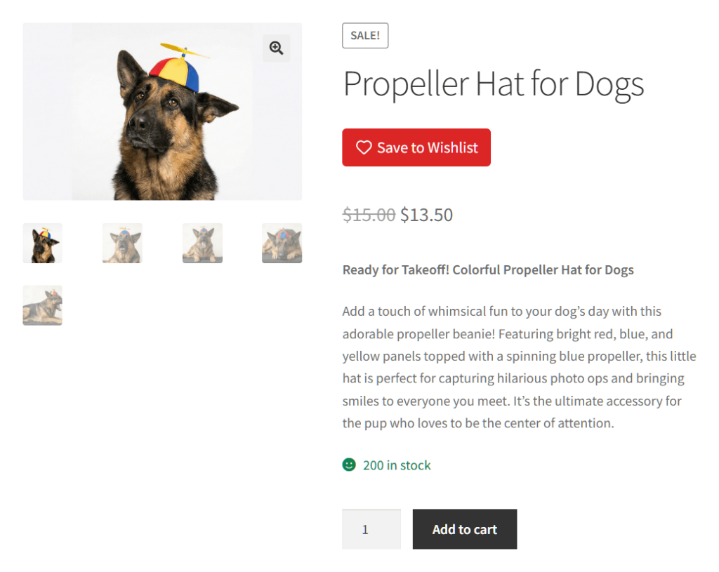
That same store placed the product-page button high in the summary, under the title and above the price. That catches the shopper who is reading detail.
| Placement | Page | What it captures | Watch out for |
|---|---|---|---|
| Below Add to Cart | Shop grid | Browsers scanning a category | Woostify clips it; check your theme |
| On the product image | Shop or product page | Fast saves while scrolling | Woostify’s gallery renders these unreliably |
| High in the summary | Product page | Considered saves from readers | Near the buy action, so contrast matters |
| Cart page | Cart | Items about to be removed | Needs an easy-to-reach wishlist page |
Getting The Button Right On Mobile
Most advice on how to optimize WooCommerce wishlists is written against a wide desktop grid. A placement that reads well there can work against you on a phone, where the controls sit closer together and a mis-tap costs you the save.
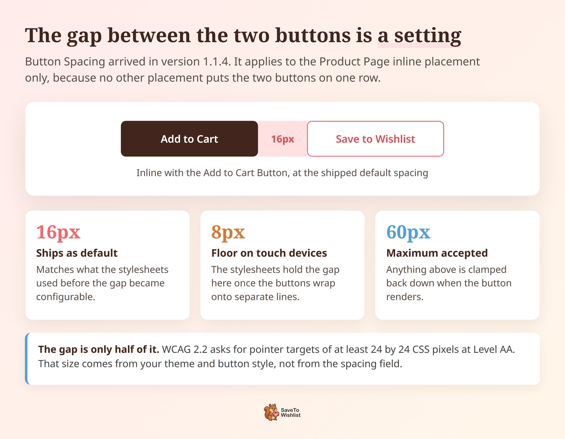
The placement to watch is Inline with the Add to Cart Button, which is offered on the Product Page only. It puts the wishlist button on the same row as Add to Cart. On a narrow screen those two land close enough that a thumb can catch the wrong one.
SaveTo Wishlist Lite added a Button Spacing field in version 1.1.4 for exactly this. It sets the gap between the two buttons in pixels and ships at 16px, accepting anything up to 60px. The field only appears once your Product Page placement is set to inline. No other placement puts the two on one row.
On touch-primary devices the plugin’s stylesheets hold that gap down to 8px. The reason is that the two buttons often wrap onto separate lines on a narrow screen. Once they wrap, the indent has nothing left to line up against. Whether they wrap depends on your theme’s Add to Cart width and its quantity field, not the device.
Sizing the tap target
The gap is only half of it. The tap target also has to be big enough to hit. WCAG 2.2 asks for pointer targets of at least 24 by 24 CSS pixels at Level AA. That size comes from your theme and your button style, so measure it separately.
🔍️ What we’ve seen: Store owners choose the inline placement on a desktop, ship it, and never open the shop on a phone. The gap looks generous at full width and closes up on a small screen. Loading your own product page on your phone takes a minute and catches this before your customers do.
Making The Wishlist Button Look Clickable
A wishlist button converts when it reads as a control and confirms the save. SaveTo Wishlist Lite ships preset button templates plus a Theme Default mode. Our wishlist button templates post covers applying them.
Aim for enough contrast that nobody mistakes the button for a label. A written “Save to Wishlist” beats a bare heart icon.
The confirmation is where we found a real difference between builds. On version 1.1.1 the label switches to “Remove from Wishlist” the moment a save succeeds. On the older 1.0.3 build we tested alongside it, the label didn’t change. That leaves the shopper no proof the click landed.
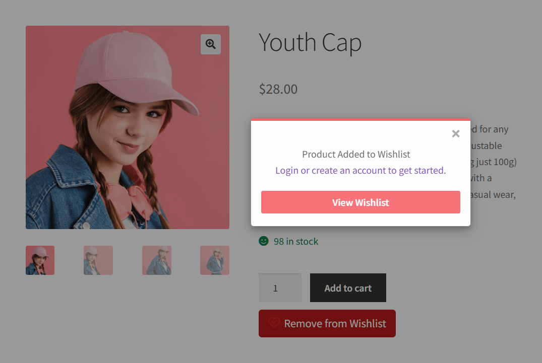
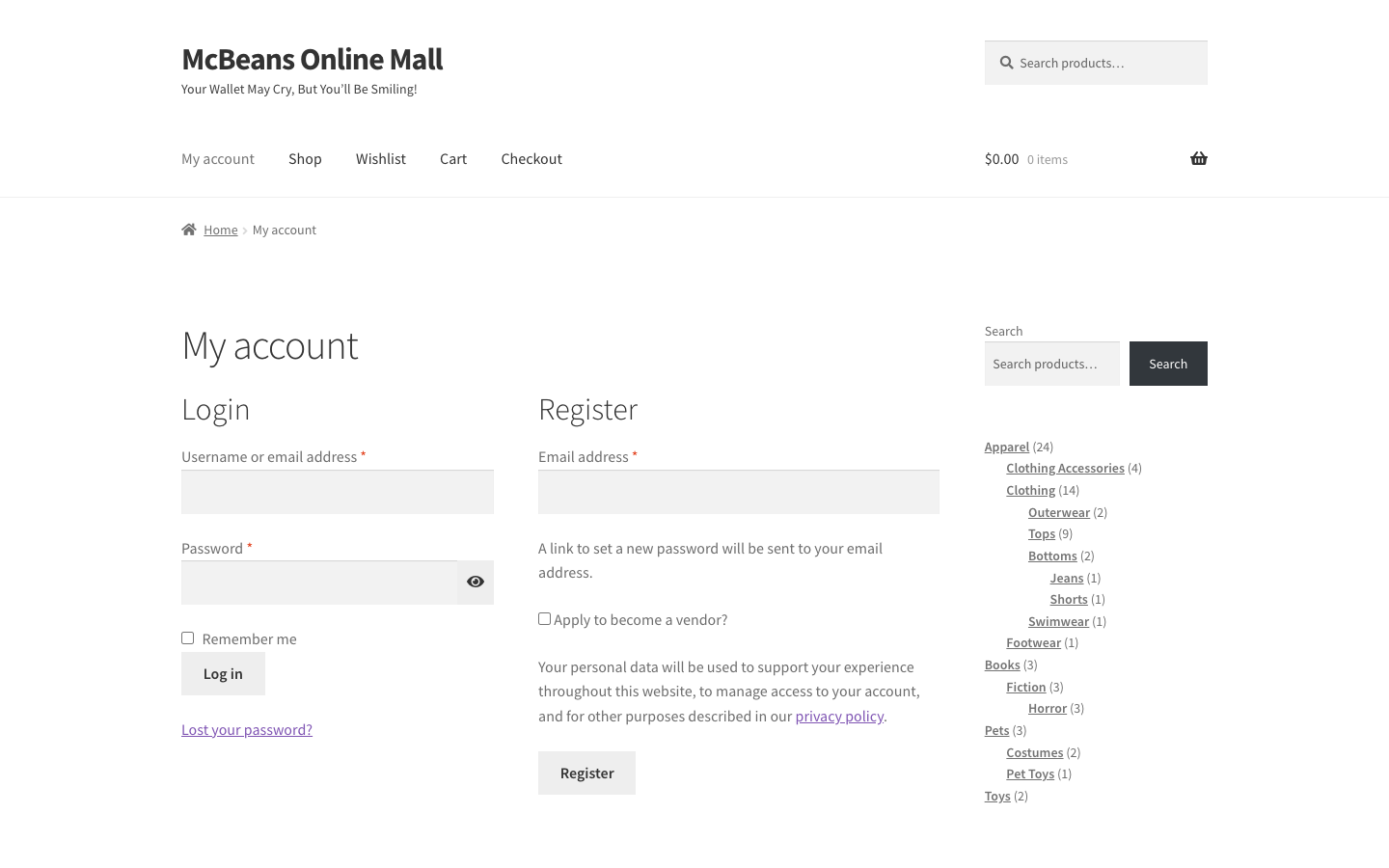
For a guest, that popup reads “Product Added to Wishlist”. It adds “Login or create an account to get started” and a View Wishlist button. That’s a trade-off, not a free win. In the same Baymard list, 18% of shoppers named required account creation as a reason they abandoned.
Choosing how the save is confirmed
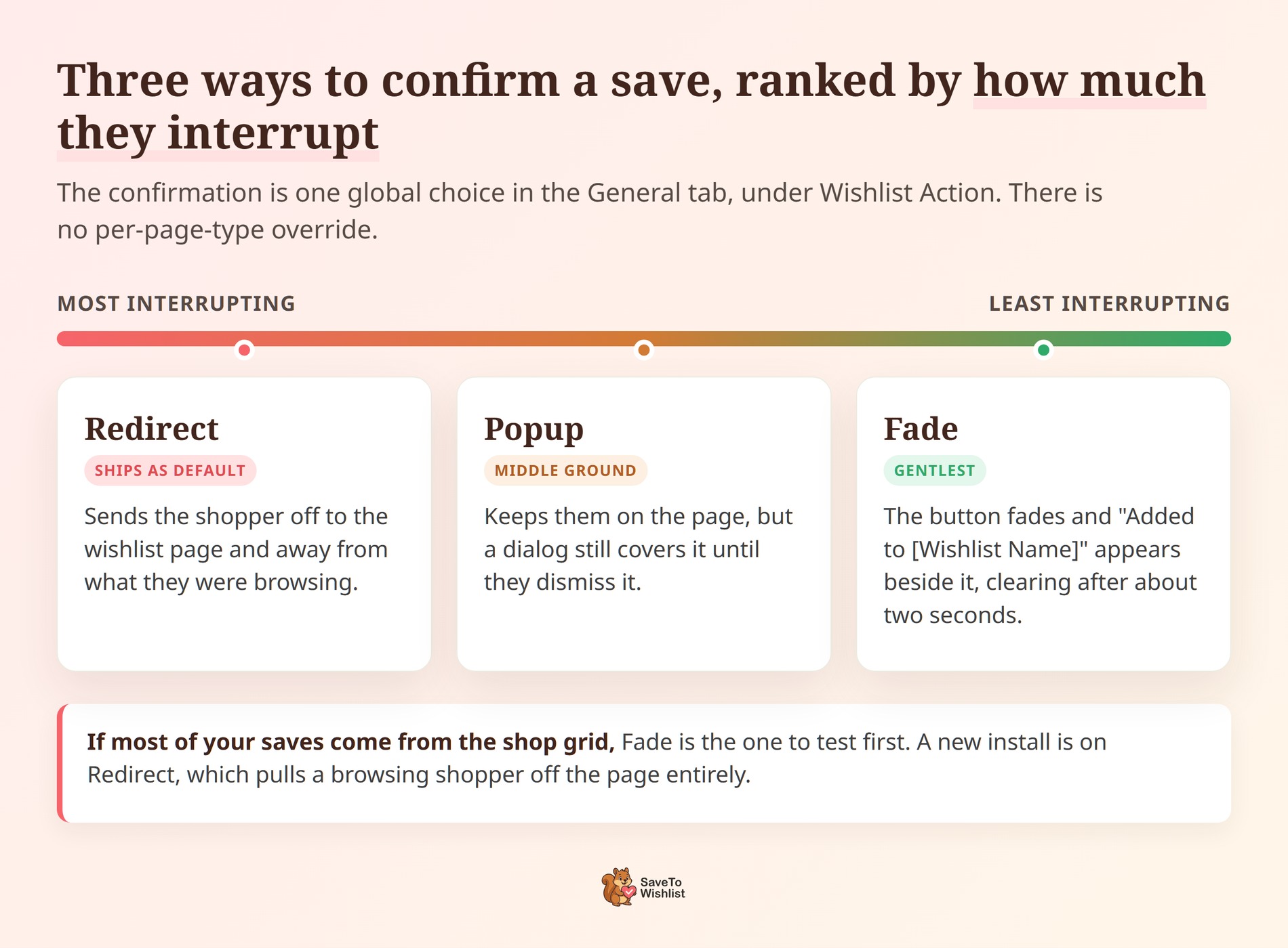
Confirmation style is the setting most people never revisit when they optimize WooCommerce wishlists. It decides what a shopper sees in the second after the click, so it is worth a deliberate choice rather than whatever the installer left behind.
🔍️ What we’ve seen: This one catches people out. The confirmation is a single global choice, not a per-page setting. You’ll find it in the General tab, under Wishlist Action. A new install runs on Redirect, which sends a browsing shopper off to the wishlist page entirely.
Popup interrupts a little less, and Fade interrupts least. The button fades, then a short “Added to [Wishlist Name]” message appears beside it. It clears after about two seconds. If most of your saves come from the shop grid, Fade is the one to test first.
When The Wishlist Button Does Not Show Up
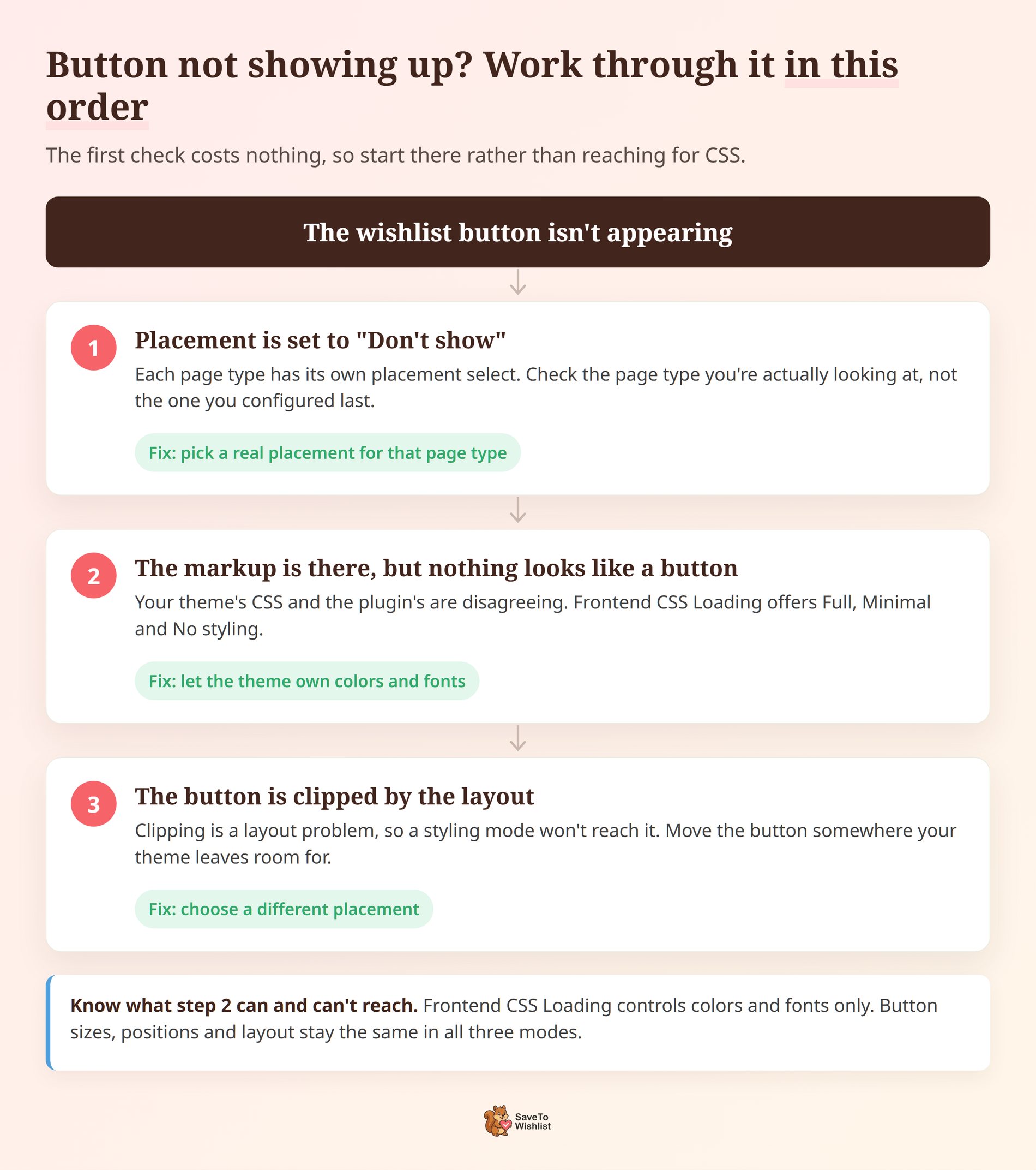
A missing button is the most common reason saves stay flat, and it’s the first thing to rule out before you try to optimize WooCommerce wishlists any further. It’s nearly always one of three things. Work through them in order, because the first one costs nothing to check.
The placement is set to “Don’t show”
Each page type has its own placement select, and each one has a “Don’t show” option. Check the page type you’re actually looking at rather than the one you configured last.
One detail catches people out here. The Shop Page setting doesn’t only govern your shop page. Choosing “Don’t show” there hides the button on category and archive pages too, which is usually where the browsing happens.
The button is there but your theme is hiding it
The markup is on the page, but nothing looks like a button. That usually means your theme’s CSS and the plugin’s are disagreeing. SaveTo Wishlist Lite has a Frontend CSS Loading setting for this, under Button Settings, and it offers three modes.
- Full styling uses the plugin’s own colors and fonts. This is what a new install runs.
- Minimal styling lets your theme override the colors and fonts.
- No styling inherits colors and fonts from the active theme entirely.
Read what that setting reaches, because it’s narrower than it sounds: colors and fonts only. Button sizes, positions and layout stay the same in all three modes. So it will fix a button that’s invisible against your background. It won’t fix one that’s clipped.
The placement conflicts with your theme’s layout
Clipping is a layout problem, so the fix is a different placement rather than a styling mode. Move the button to a position your theme leaves room for, then check the same page again. Our Woostify wishlist buttons guide walks through this on the theme where it comes up most.
🔍️ What we’ve seen: A store owner checks one product page, sees the button, and assumes the whole shop is covered. Placement is set per page type, so a working product page tells you nothing about the category grid. It’s an easy one to miss. Open a category page and your cart page before you move on.
Fixing The Wishlist Page Itself
Treat the wishlist page as a second checkout, not a storage cupboard. If a shopper can’t reach it in one click from your navigation, your saves sit there unread.
Three things move the needle:
- Where the list lives: SaveTo Wishlist Lite gives you the
[saveto_wishlist]shortcode and a Gutenberg block. The list can then sit on a real page in your menu, not just inside an account tab. Pro adds control over which columns it shows. - Add All to Cart: one control that turns a list of maybes into a single order.
- The after Add All to Cart redirect: send shoppers to the Cart page or straight to Checkout. Checkout removes a step for people who have already decided.
Two defaults worth changing
Two settings on that page ship on a value that works against you, and they are the quickest wins left once you optimize WooCommerce wishlists everywhere else. They’re worth opening even if the rest of the defaults suit you.
After Add All to Cart ships as “Stay on Wishlist Page”. A shopper who just added everything is left looking at the list they’ve already acted on. Nothing prompts them toward the cart.
Switching it to Redirect to Cart Page or Redirect to Checkout Page is a single change. Checkout is the shorter path for someone who has clearly decided.
Hide Disabled Add to Cart Buttons ships as No. That means a saved item which can’t currently be bought still shows an Add to Cart button that does nothing. Out of stock, no price, and not purchasable all count. Turning it on removes the dead control instead of letting a shopper tap it and get nowhere.
🔍️ What we’ve seen: The wishlist page gets set up once and then never gets visited by the person who owns the store. Save two or three products yourself, including something out of stock, then walk the page as a customer would. The gaps show up in about a minute.
Getting More Saves From Guest Shoppers
Guest saving is on when you install the plugin. The Disable Guest Wishlist switch sits at No, so a shopper who has never made an account can still save.
The decision worth revisiting is what that shopper sees the moment they do. By default the confirmation carries a login and create account link. The setting behind it is called Always Show Login/Create Account Link, and it ships as Yes.
Leaving it on is a real trade, not a free win. It’s the fastest route to a list that outlives the browser it was made in. It also puts a signup ask in front of somebody whose only intention was to save something for later.
If your store sells things people research over days rather than minutes, the account is usually worth asking for. If most of your traffic is first-time and mobile, the prompt is worth testing without.
Note the setting disappears from the screen if you switch Disable Guest Wishlist to Yes. There’s no guest confirmation left for it to apply to.
🔍️ What we’ve seen: Stores measure this the hard way. They turn the prompt off, watch saves climb, then count it as a win. Saves and saved-and-reachable are different numbers. Track both for a couple of weeks before you decide which one you were optimizing for.
Measuring Whether Your Wishlist Optimization Worked
Change one thing at a time, then watch saves per session for two weeks. That discipline is what separates a store that happens to optimize WooCommerce wishlists from one that can prove it did. Placement and confirmation style move the same number, so changing both at once tells you nothing about which earned the lift.
Three signals are worth tracking:
- Save volume by page type. If shop-grid saves stay flat after you add the button there, the problem is style or contrast, not coverage.
- Repeat saves per shopper. People saving several items are the ones your reminder emails will convert.
- Products saved but never bought. Pro reports these as High Wishlist / Low Sales Products. The gap usually points at pricing, stock availability, or a promotion worth running.
Everything above runs on SaveTo Wishlist Lite, which is free. Measurement is where the paid extension earns its place. SaveTo Wishlist Pro groups its wishlist analytics into five sections. Those are Product Insights, Category & Brand Insights, Engagement & Conversion Insights, Time-Based Trends & Patterns, and Customer Behavior & Engagement.
Two of them answer “did my placement change work”. Engagement & Conversion Insights and Time-Based Trends & Patterns show additions over time, not a running total. The data is cached for about an hour. Use the Update Now button for a fresh read straight after a change.
Once saves rise, the next question is how many become orders, which our guide to wishlist conversion rate covers.
Frequently Asked Questions: Optimize WooCommerce Wishlists
How many wishlist saves is normal?
There’s no universal benchmark, and any number quoted as one deserves suspicion. Judge your store against itself. Record saves per session for two weeks before a change, then compare the same window after. Borrowed benchmarks measure someone else’s placement, not yours.
Can guests save items without creating an account?
Yes. Guest wishlists work out of the box in SaveTo Wishlist Lite, stored in browser localStorage. They merge into the account on login or registration. The catch is that a guest list lives in one browser, so a phone save won’t show on a laptop.

Start Optimizing Your WooCommerce Wishlist Today
None of this is a plugin problem. Every change above is a decision about visibility that somebody has to make, which is why the stores that optimize WooCommerce wishlists well tend to be the ones that opened the settings at all. Stores getting little from their wishlist usually accepted a default.
Work through it in this order:
- Why Most WooCommerce Wishlists Get Almost No Use: treat low saves as visibility, not demand.
- Where The Wishlist Button Should Actually Go: add the shop grid, then the product page.
- Getting The Button Right On Mobile: mind the gap on the inline placement.
- Making The Wishlist Button Look Clickable: fix contrast and label, pick Fade for browsing pages.
- When The Wishlist Button Does Not Show Up: check placement, then styling mode, then layout.
- Fixing The Wishlist Page Itself: put the list in your navigation, redirect to Checkout.
- Getting More Saves From Guest Shoppers: decide what that first click should cost.
- Measuring Whether Your Wishlist Optimization Worked: change one thing, watch saves per session.
All of that runs on SaveTo Wishlist Lite for free. For analytics proving which change worked, SaveTo Wishlist Pro is the paid extension.
Growth is $49.50 the first year, then $99. Plus is $99.50 then $199, and Business is $199.50 then $399. The Gift Registry Addon is in Plus and Business only.